200+ ways to measure your performance
At your fingertips, you have more than 200 performance measurements available. Some of the most useful ones are located in strategy performance summary, performance ratios, time analysis, list of trades, total trade analysis, outliers, run-up and drawdown, trade series analysis and periodic analysis.
Strategy Performance Report
Strategy Performance Report
Strategy Performance Report
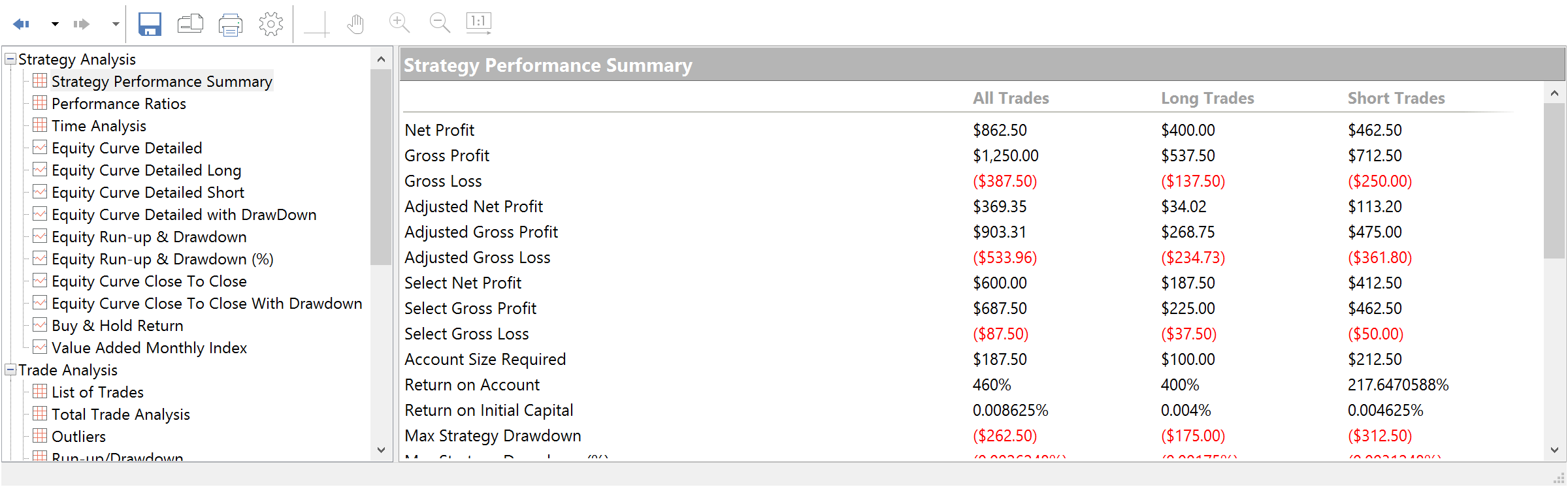
Analyzing backtesting results
Strategy Performance Summary and Performance Ratios allow for quick analysis of your trading strategy metrics. You can access the overall profit or loss achieved by the trading strategy, different ratios values, detailed equity curve data and much more important info at your fingertips.
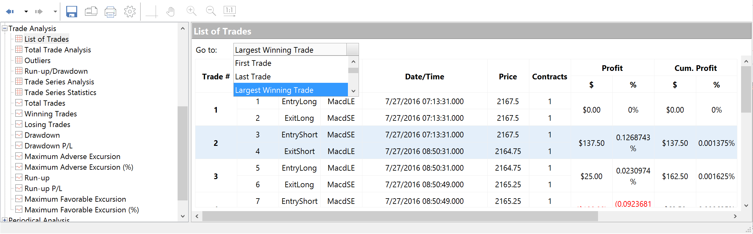
Tracking by time and by trade
The information in the Time Analysis table evaluates results strictly from the standpoint of time. You set the time frame for displaying the results using the Display tab of the Setting dialog box. List of Trades displays the complete trade-by-trade report.
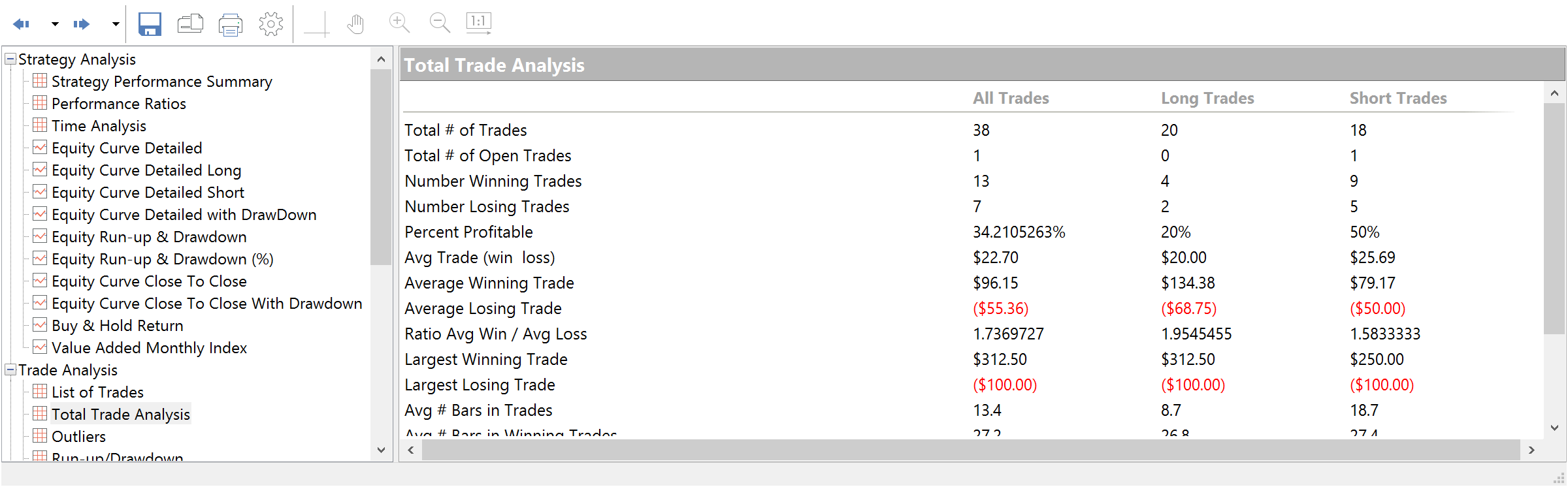
Total and outlier analysis
Total Trade Analysis displays overall performance of the trading strategy. Outliers or outlying trades are those that exceed the average trade by a significant value (plus or minus three (3) standard deviations).
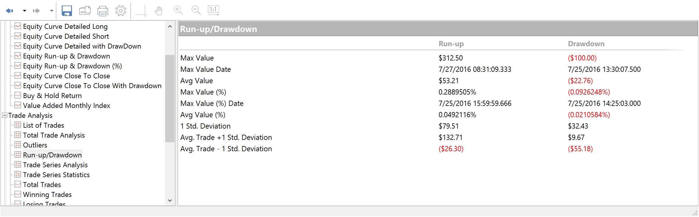
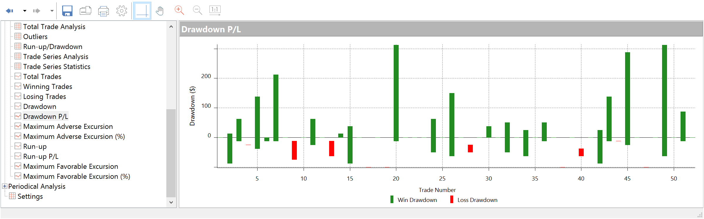
Run-up/drawdown and trade series analysis
Run-up/drawdown and trade series analysis Run-up is measured as the open to the highest unrealized high of the trade for a long position; drawdown is from the open to the lowest unrealized low of the trade for a short position. Trade Series Analysis displays statistical measures based on the winning and losing trades.
Strategy Performance Report
Strategy Performance Report
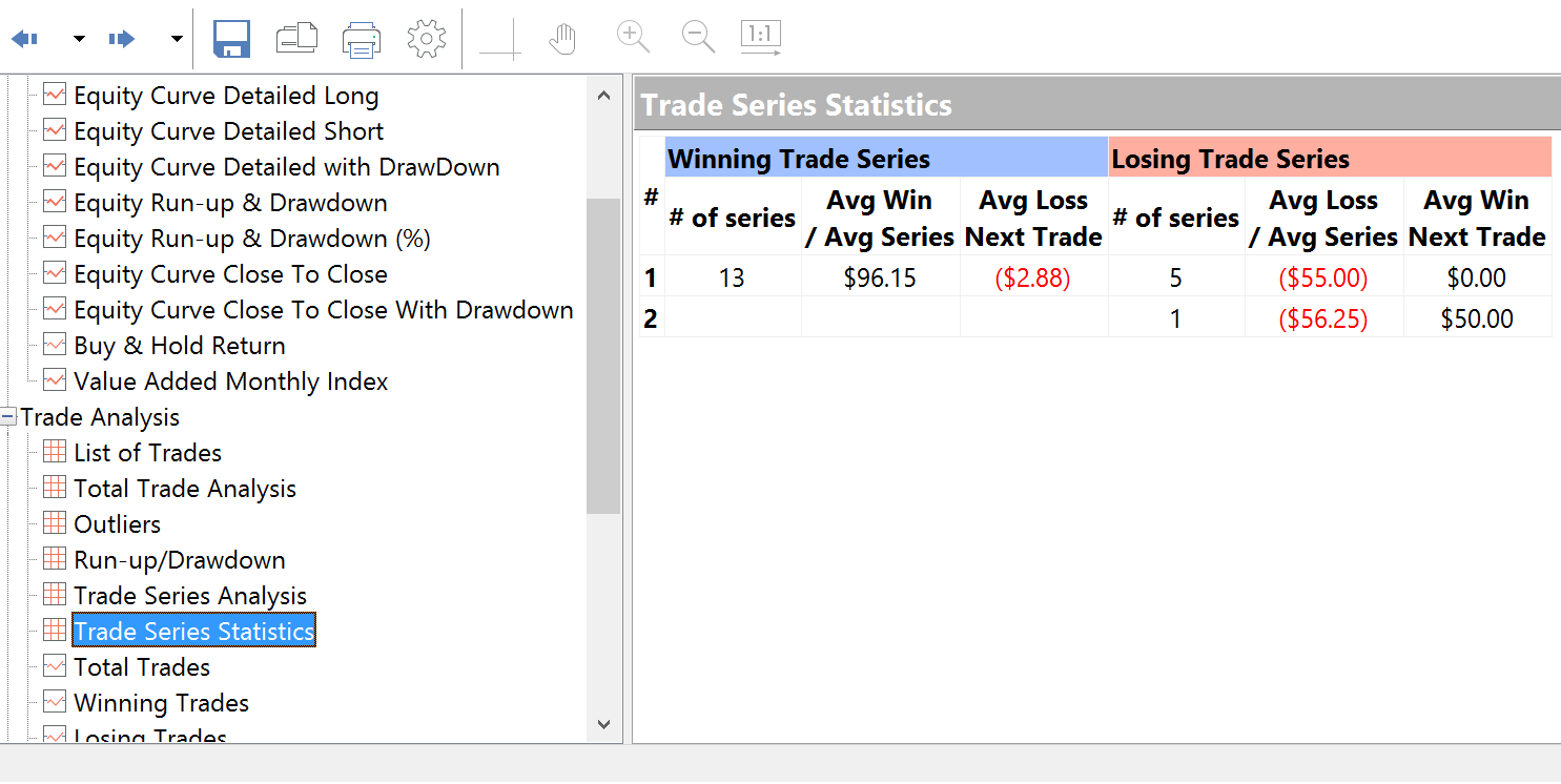
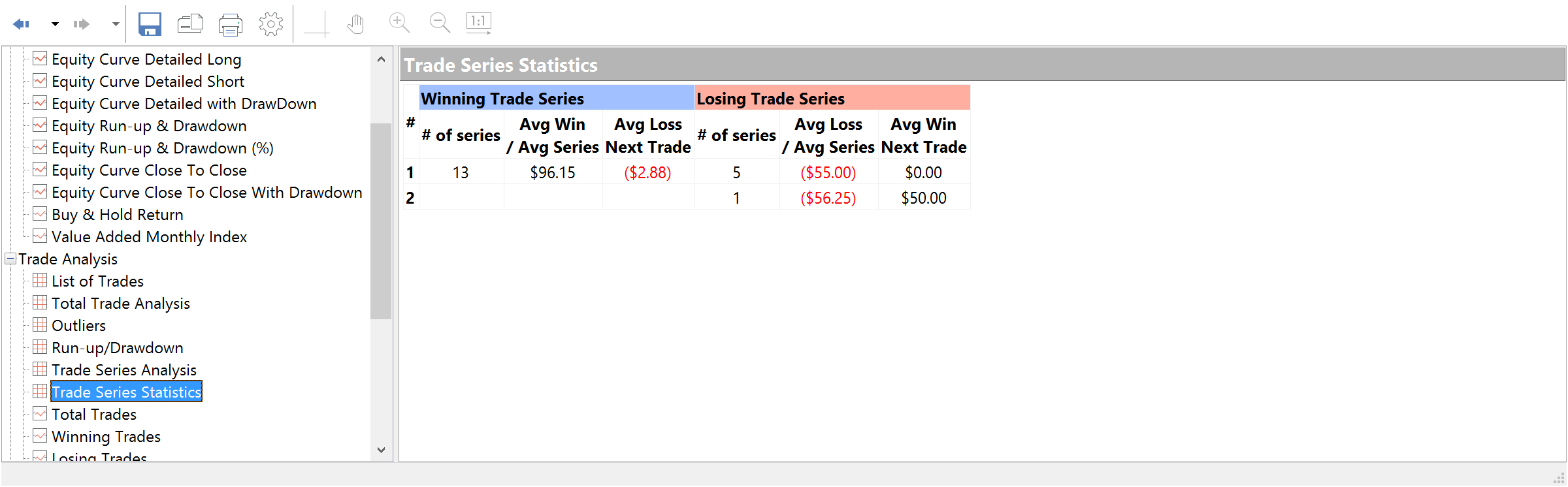
Statistical analysis
Every professional trader who wants to fully exploit the potential of algorithmic trading has to understand statistics and to know the most widely used statistical methods which can be useful for evaluating the potential robustness of trading strategies. Trade Series Statistics displays information on the consecutive winning (losing) trades series.
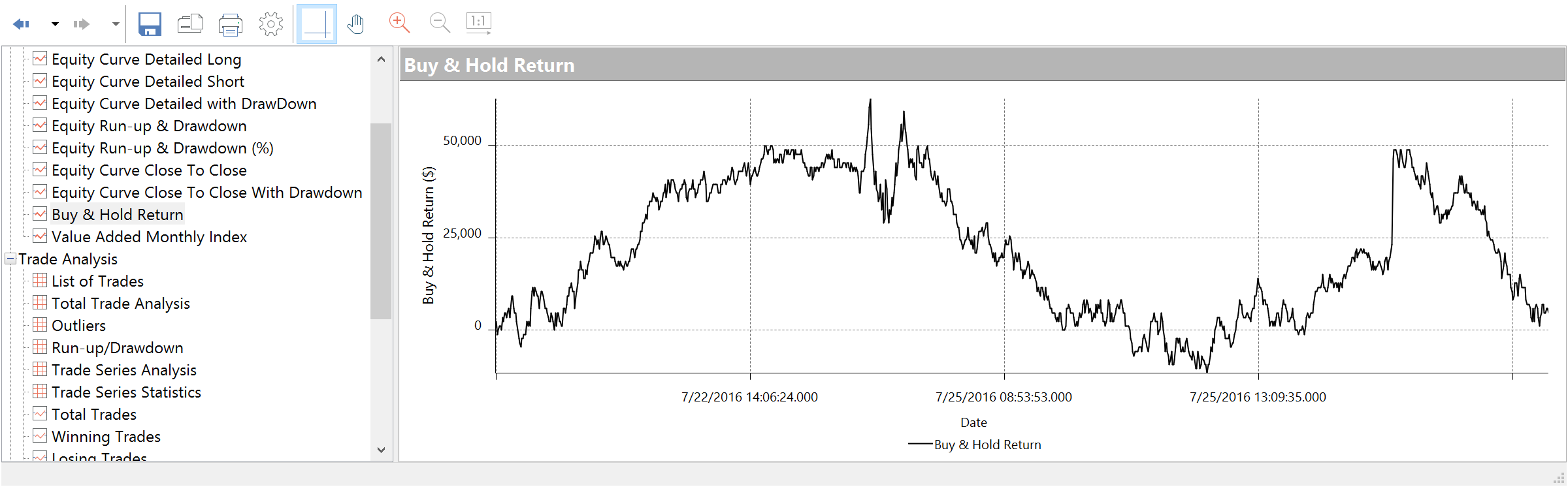
The buy and hold strategy
This is a long-term passive investment strategy in which an investor buys and holds shares for a long period of time, regardless of fluctuation in this market. If you are trying to compare the total net profit of the strategy and the Buy/Hold Return, please remember to keep in mind that the buy and hold strategy can lead to major drawdowns as well as risks because your investments are still exposed to market moves for the whole period.
Strategy Performance Report
Interactive graphs that show the complete picture
MultiCharts includes 28 interactive graphs to display relative and absolute values. Drawdown, for example, is shown in relative values, which allows you to see the realistic picture.
Strategy Performance Report
Strategy Performance Report
Strategy Performance Report
Relative drawdown
This graph balances equity against trade number for all closed trades and also includes both drawdown dollars and drawdown percentages.
Insight using equity curve graphs
This graph allows greater insight into trading performance than a usual equity curve graph. It displays net profit on a bar-by-bar basis revealing equity drawdowns and run-ups.
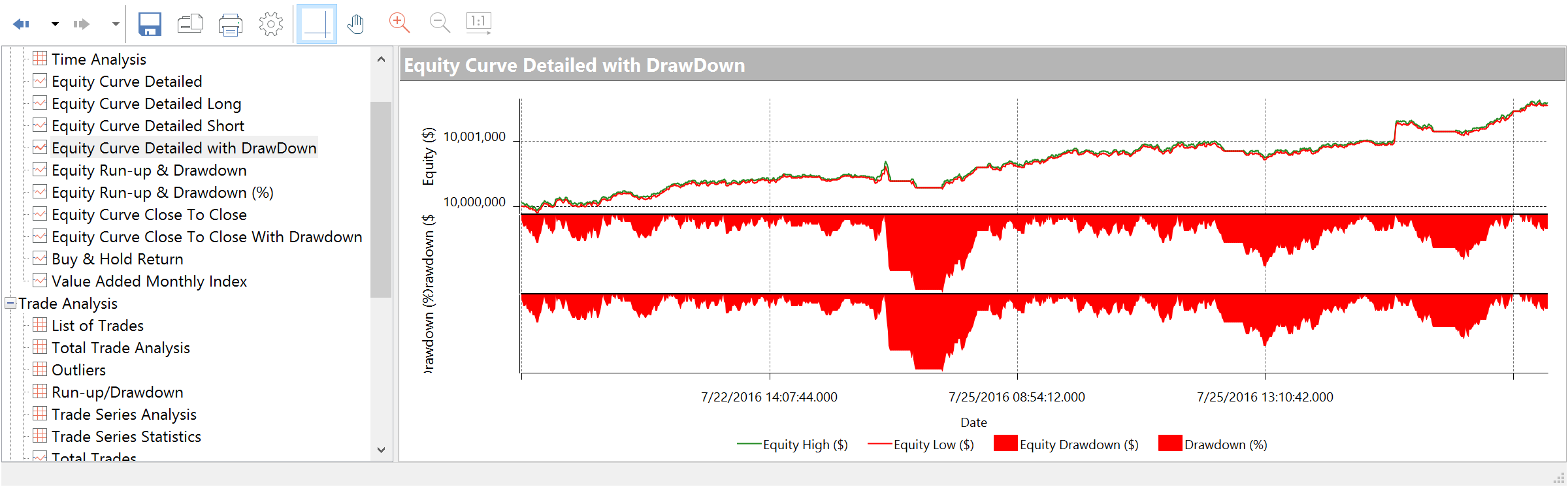
Equity curve with drawdown details
This detailed Equity Curve graph combined with both Drawdown ($) and Drawdown (%).
Equity run-up and drawdown
These graphs illustrate equity drawdown vs. equity run-up in dollars and percentages.
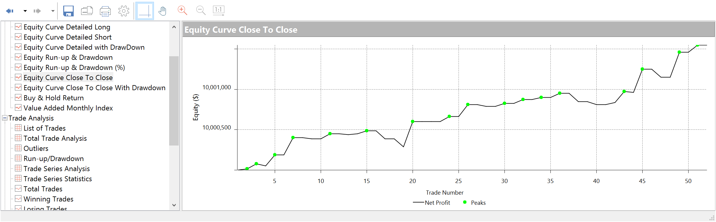
General analysis of trading performance
This graph displays an equity (in $) vs. trade number for all closed trades. This all-purpose equity chart is best used for general analysis of trading performance.
Total trades and winning trades
These graphs display the profit (in $) vs. trade number for all trades or for all winning trades. The horizontal line stands for the average trade.
Determining protective stops
The Maximum Adverse Excursion graph is best used to determine protective money management stops for a trading strategy. It graphs each trade's realized Profit/Loss vs. Drawdown in a scatter graph format.
Determining trailing stops
The Maximum Favorable Excursion graph is best used to determine trailing stops for a trading strategy. It shows the realized Profit/Loss vs. Drawdown in a scatter graph format. The green arrows represent winning trades, and the red arrows represent losing trades.
Long-term evaluations
The Maximum Favorable Excursion graph uses percentages rather than dollar amounts. This graph is best used for long-term evaluations.
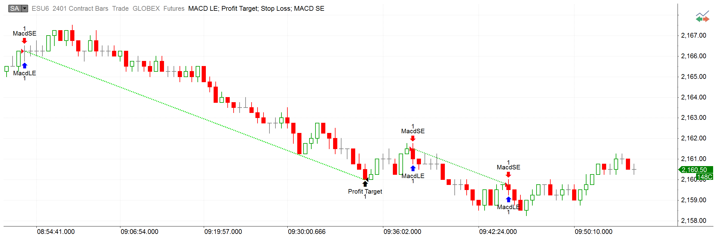
One-click charts
In MultiCharts, looking up a particular trade takes just one click. You have 16 qualifying parameters to filter all trades and as soon as you identify the trade that interests you, all it takes is a click to display it on a chart. This allows you to see the trade in the report and the graphic chart representation when the trade was created enabling you to quickly identify flaws in entering and exiting methods and to improve trading logic.
MultiCharts
Strategy Performance Report