Monte Carlo Analysis
Contents
What is the Monte-Carlo method?
General information
An overview of the history and development of the Monte-Carlo Analysis method can be found, for example, in Wikipedia
The Monte-Carlo method is the method of statistical modeling in problem solving based on modeling a random process with parameters equal to the specific values of the original task.
This method is used in various spheres (mathematics, physics, economics, sociology, etc.). MultiCharts as an analytical and trading platform allows the use of the Monte-Carlo method in addition to other existing tools, such as, Backtesting, Optimization, Strategy Reports and others.
Field of use in MultiCharts
Monte-Carlo analysis is used in MultiCharts for analyzing the strategies after performing backtesting on a Chart or in a Portfolio, or for analyzing trade performance on a trading account or accounts.
What can the Monte-Carlo Analysis be used for?
Although a backtest of a strategy can produce profitable results, those results may have just been a fortunate turn of events, and the strategy may be unprofitable in the future or have huge risks.
Monte-Carlo Analysis allows for the creation of a normal distribution of base characteristics of trading (net profit, drawdown, gross profit, gross loss, etc.) by running a greater number of simulations. Based on this information, a user can evaluate extreme values of trade characteristics along with most probable outcomes.
How does it work?
While backtesting a strategy on a chart or in a Portfolio or trading manually on one or a number of instruments with one or several accounts (brokers), you get a number of closed trades in chronological order. These trades, when plotted on a graph, form an equity curve. Equity curve is displayed in our reports (in Strategy Performance Report, Trading Performance Report, Portfolio Performance Report) and has a number of statistical characteristics, such as, net profit, drawdown, gross profit, gross loss, etc.
Based on the equity curve, simulations will be generated when performing Monte-Carlo Analysis. Every simulation is a set of randomly rearranged trades of base equity curve, and the same characteristics are calculated for each simulation. Normal distribution of every trade characteristic and its visual representation as graphs and tables will be calculated as a result of this analysis.
How to access Monte-Carlo analysis window
Ways to access Monte-Carlo analysis
As described above, Monte-Carlo analysis is performed on trades of the base equity curve that resulted from trading or strategy backtesting. You can access Monte-Carlo analysis from:
- Strategy Performance Report To access a Strategy Performance Report apply a strategy to a chart, in the menu select View then click Strategy Performance Report.
- Trading Performance Report To access a Trading Performance Report connect a broker profile, make sure that you have manual trades on the chart, in the menu select View then click Trading Performance Report
- Portfolio Performance Report To backtest a portfolio сlick the BackTest button on the toolbar, or select Portfolio in the main menu and then select Run Backtesting.
- Trades Summary To access Trades Summary go to File -> New -> Order and Position Tracker Window -> Trades Summary Tab.
To access the analysis, click on “Monte-Carlo Analysis Run” (in the first three cases the button is located at the top: in the toolbar of the report window; in Trades Summary Tab in OPT the button is below the “Generate” button)
Getting started
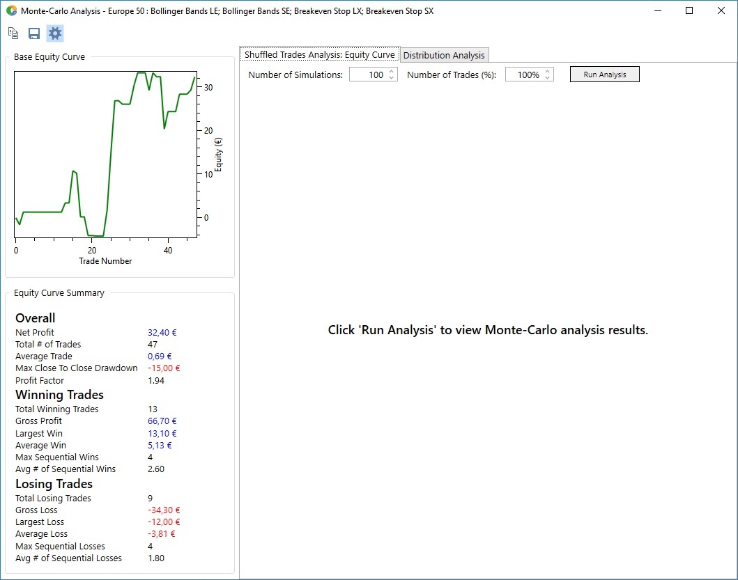
After clicking “Monte-Carlo Analysis Run" the analysis window appears. On the left side of the window there is a short summary of the base equity curve and the graph (it can be hidden by clicking the button on the toolbar above), the settings for the analysis and the result display are located on the right side of the window.
Setting up and running Monte-Carlo Analysis. Results.
Types of analysis
As described above, in Monte-Carlo analysis, trades from the base equity curve are combined in a random order for each simulation. Let’s take sample ABCD equity curve with 4 trades: A, B, C and D. There are 2 types of analysis that are based on different methods of running the simulations.
- Shuffled Trades Analysis – each simulation for this type of analysis is created by random shuffling of the base equity curve trades. The possible outcomes are ABCD, ACDB, BCAD, DABC etc. (each trade can be used only once per simulation).
- Distribution Analysis – any trade from the base equity curve can be used multiple times in one simulation for this type of analysis: ABCD, AABB, ACDC, ABBA, DDDD.
Setting up the parameters
Parameters of analysis that can be defined by a user:
- Number of simulations – the number of simulations generated. Minimum number is 10 for both types of analysis, it is the minimum number of simulations, which gives an approximate idea of characteristics distribution.
Maximum number for Shuffled Analysis is 100, for Distribution Analysis – 10,000. In MultiCharts 11 this number was increased to 100 000 simulation for both types of analysis.
- Number of trades – the number of trades in one simulation, calculated in % of quantity of base equity curve trades, default value = max value = 100%. The number of trades in simulations can be decreased when processing large amounts of data (e.g. hundreds, thousands or millions of trades) to speed up the results. Practice shows that with large amounts of data a decrease in the number of trades per simulation does not lead to a significant difference in the results due to random selection of trades while forming the simulations.
Start the analysis
Start the analysis by clicking “Run Analysis” button.
Results of the analysis
Results of the analysis are presented in different tabs for different types of analysis.
- For Shuffled analysis they are presented as a graph , in which all of the generated simulations are plotted along with the base equity curve. As simulations are generated by shuffling the trades of the base equity curve, most of the characteristics (net profit, gross profit, gross loss) will coincide for all of the simulations, so the analysis is aimed at evaluating risks through extreme and average MaxDrawDown values. Curves with the Largest and Smallest MaxDrawDown values are highlighted with different colors.
- For Distribution Analysis the results are presented as a graph or table of normal distribution of statistical parameters selected by a user.
X-Axis
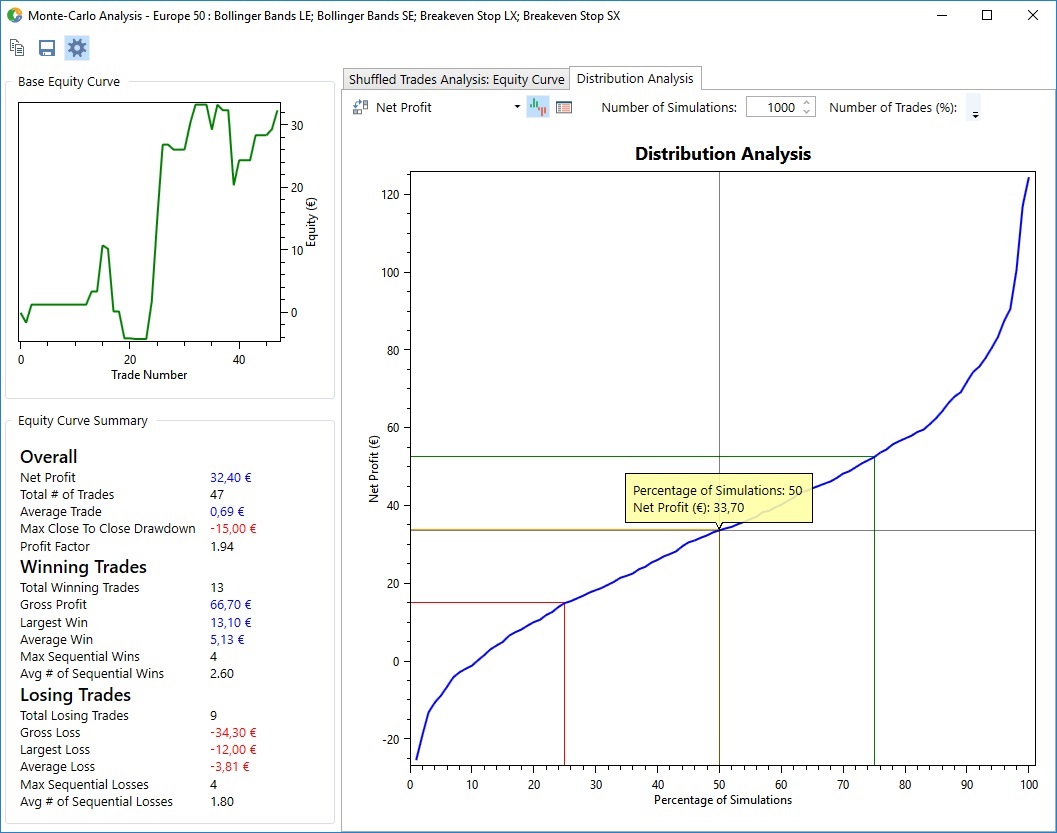
The horizontal axis of the Distribution Analysis graph shows the share of simulations (in %) the characteristics of which are below the value of Y-axis. For example, if you select 1000 as the Number of Simulations for a Net Profit graph (as at the screenshot above), the point A means that the Net Profit value of 500 of the simulations will be below €33,70, and Net Profit value of the remaining 500 simulations will be more than €33,70.
This graph also allows you to see both best and worst case scenarios to evaluate the risk/reward ratio of your strategy.
Y-Axis
The vertical axis of the Distribution Analysis graph displays the parameter selected for the analysis such as Net Profit, Max Drawdown, Gross Profit, etc.

