Hello Henry,
here is the code:
Code: Select all
[LegacyColorValue = true]


Inputs: Strength(2),

        TicksToShift (2);


Variables: oneTick (0),

           TickShift(0);


value1=swinghigh(1,h,Strength,80);

value2=swinglow(1,l,Strength,80);


if value1>-1 then plot1(value1,"BuyFractal");

if value2>-1 then plot2(value2,"SellFractal");


once

begin

oneTick = MinMove/PriceScale;

TickShift = oneTick * TicksToShift;

end;


//High shifted up TicksToShift ticks

Plot1(High + TickShift, "High");

//Low shifted down TicksToShift ticks

Plot2(Low - TickShift, "Low");
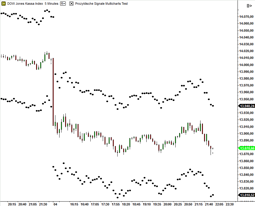
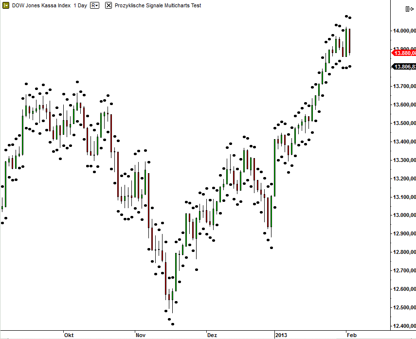
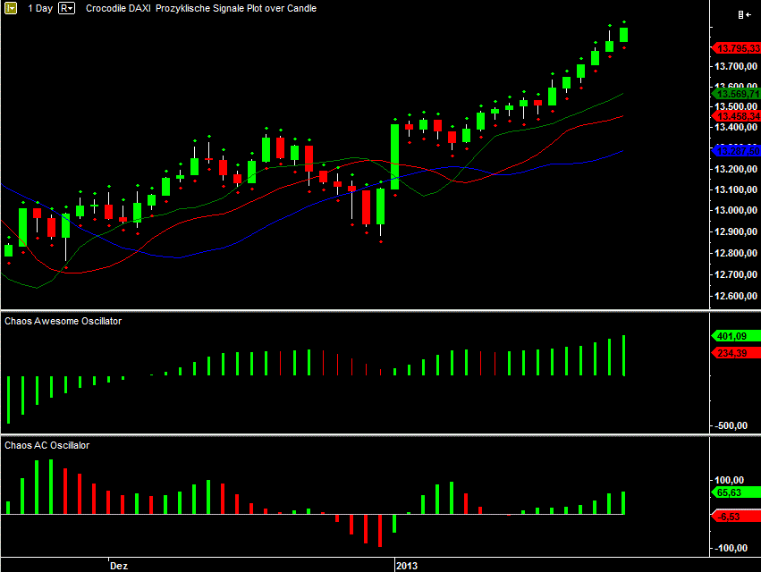
In the DOW Jones Chart ($INDU) it seems that the dots are to near by the candle.
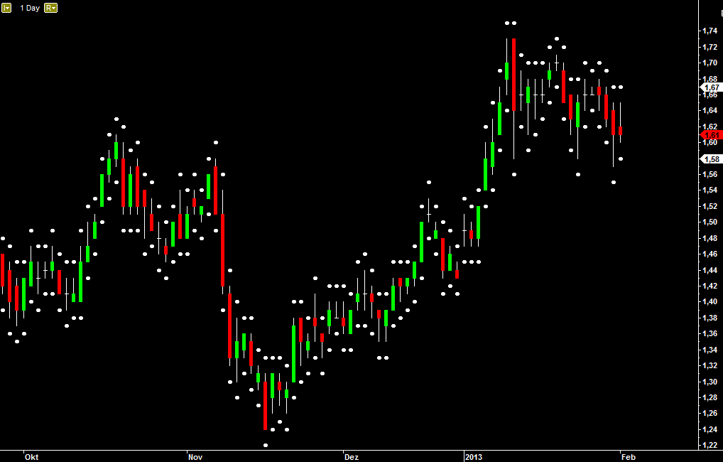
In the CBK-XET Chart it looks good.
Here is The Scale from the Chart:
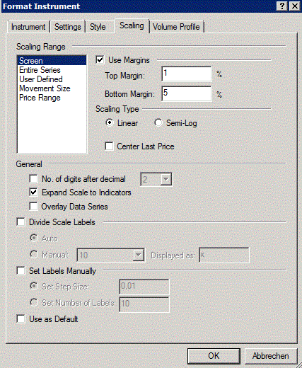
And that is the scale from the indicator:
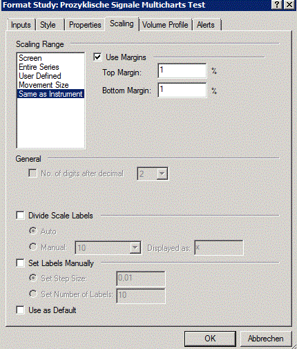
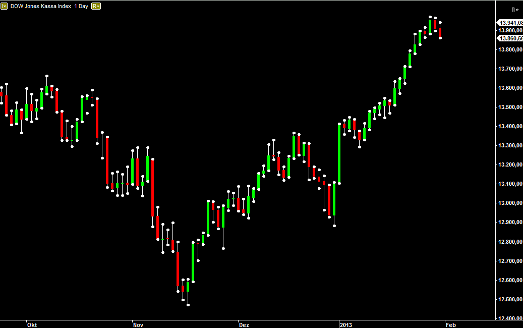
When i set the tickstohift to 2000 like this:
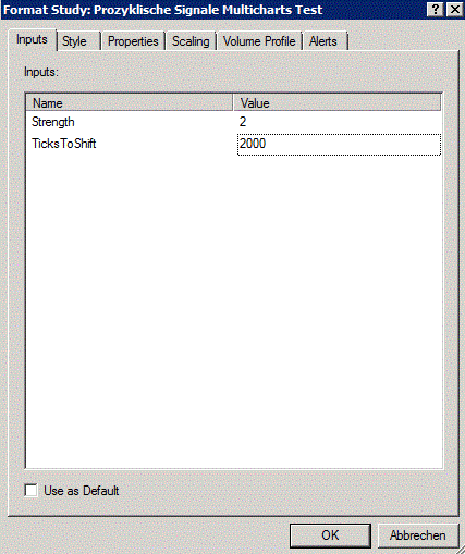
Then the DOW Jones looks good.
And the CBK-Chart looks terrible.

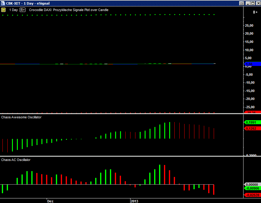
So i look for an formula, where the Differenz between the high and the dot und between the low and the dot is still the same.
Best regards
Kinko