Okay, we're running the indicators on daily bars of MSFT quotes and have 3 years, worth of those:
1. ADX, the modified directed movement index that shows not only the strength, but the direction of the trend as well;
2. Band-pass indicator a correctly plotted MACD analogue based on tripolar Butterworth filters (an exponential average is a single-pole
Butterworth filter);
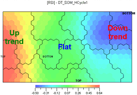
3. RSI;
4. stochastic;
5. a couple of proprietary indicators detecting trending and cyclic phases of the market by spectral analysis;
6. new tops and bottoms; 1 when the price crosses over its top for the dominant cycle;-1 when the price crosses under the bottom and 0 if vice versa; peaks and valleys. A
peak here is considered to be a SwingHigh of strength 2, i.e., the top of the bar flanked by two smaller tops on both sides and
corresponding SwingLow a valley.
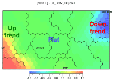
Let's export those indicators from Omega TradeStation into any neural network implementing the Kohonen's self-organizing maps (SOM). The entire multitude of indicators is a multi-dimensional area. The neural network will find common properties in the behavior of the indicators and will project the multi-dimensional market structure described by the indicators onto a plane as a 'political map' where the 'countries' clusters are different conditions of the market. The neural network clearly defines uptrends, downtrends and sideways trends form the indicators data (Ill.1, left). Il.1 shows the same map in more detail, i.e. we can see four areas where tops and bottoms are grouped (marked TOP and BOTTOM). The map's detail level can be changed if desired.
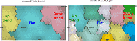
Ill.1. The same market map with different cluster resolution levels.
Now let's move on to indicator analysis. Every given indicator is a section of the overall multi-dimensional area and will be a 'map' as well, where 'seas' are lows and 'mountains' - highs. For instance, the location of tops and bottoms on Ill.1 is based on the maps from Ill.2. Further we'll see that even improved indicators do not identify those points. The scale below is a measure of probability of finding a peak or valley in the given point of the market. Notice there's one zone of high probability in both trending and non-trending phase of the market.
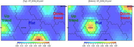
Ill.2. Peaks on the left, valleys on the right.
Ill. 3. A sort of a 'Find a difference' puzzle. All indicators show practically the same.
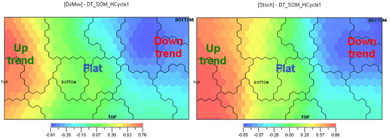
Ill.3. DMI on the left, Stochastik on the right and RSI on the bottom.
Well, this is clear enough without any analysis: all oscillators perform two functions: removing the trend and smoothening. The details
don't matter, so our first conclusion is: all oscillators are the same.
The map of new tops and bottoms also displays a striking similarity with the oscillators.
Ill. 4. New tops and bottoms.
Now to our 'secret' trend indicator (Ill. 5, on the left), based on completely different principles from the previous oscillators. The
IsTrend oscillator value equals 1 for an uptrend, -1 for a downtrend and 0 for absence of trend. See how similar it performs to DMI, RSI and
stochastic at Ill.3.
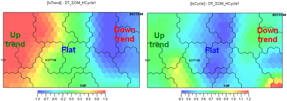
Ill. 5. Trend indicator on the left, cycle indicator on the right.
Conclusion 2. Oscillators really are trend indicators. Let's compare Ill.3 and Ill.5. The IsCycle indicator defines the market phase as cyclic if its value is minimal. Now see how oscillators behave in a cyclic area (blue area at Ill. 5 on the right). Widely acclaimed authors keep telling us oscillators should be used on a cyclic, i.e. non-trending market. But here in the cyclic phase the oscillators show overall green and nothing more meaningful. Also, for better credulity let's review an analog of MACD that coincides with the price by phase (Ill. 6 on the left) and the optimal filter going ahead of price by phase (Ill. 6 on the right). Although a part of their extreme values fall within the cyclic area, they do not coincide with the extreme values of the prices. Hence conclusion 3, oscillators are not able to identify extreme price values in a cyclic area.
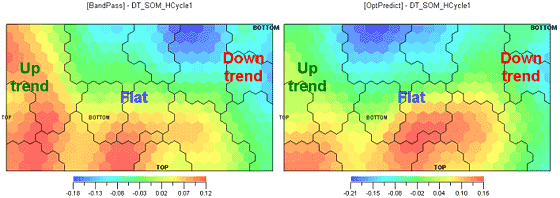
Ill.6. BandPass indicator on the left, optimal anticipating filter on the right.
Now on to the most interesting question . do indicators have predictive abilities?
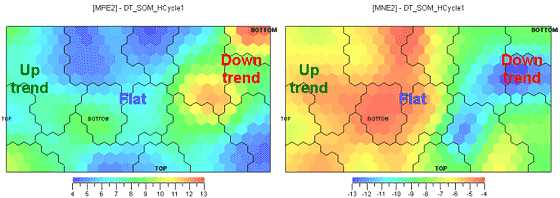
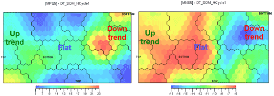
Ill.7. Maximal price growth (MPE) on the left, maximal price fall (MNE) on the right for the next two days, %.
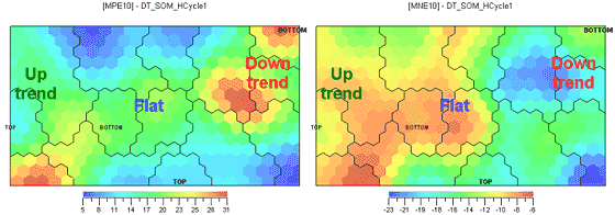
Ill.8. Maximal price growth (MPE) on the left, maximal price fall (MNE) on the right for the next five days, %.
Ill.9. Maximal price growth (MPE) on the left, maximal price fall (MNE) on the right for the next ten days, %.
Let's associate the potential of possible income/loss for 2, 5, and 10 days with every bar (Ill.7-9). Those values were NOT used in neural network training, so there is no danger of curve fitting. Note that the picture doesn't change much as the time interval grows. The potential buy point will therefore be defined as the point where potential price growth is maximal and potential price fall minimal. Analogously, the potential sell point will be the point where potential price fall is maximal and potential growth minimal. Those points correspond to close colors on the left and right charts. For instance, the optimal sale zone is the lower right corner where the potential growth and fall are as per the table:
| Component | Mean | Std. deviation | Minimum | Maximum | Sum |
| MPE2 | 4.21 | 0.14 | 4.08 | 4.53 | 117.66 |
| MNE2 | -7.70 | 0.21 | -7.96 | -7.25 | -218.42 |
| MPE5 | 5.20 | 0.50 | 4.70 | 6.40 | 141.90 |
| MNE5 | -14.98 | 0.63 | -15.68 | -13.71 | -428.36 |
| MPE10 | 6.70 | 0.80 | 5.70 | 7.90 | 174.70 |
| MNE10 | -22.28 | 0.68 | -23.14 | -21.22 | -635.23 |
So the optimal buy zone, correspondingly, is located in the lower left corner of the charts:
| Component | Mean | Std. deviation | Minimum | Maximum | Sum |
| MPE2 | 8.65 | 0.61 | 7.83 | 9.54 | 290.60 |
| MNE2 | -4.94 | 0.19 | -5.27 | -4.73 | -162.97 |
| MPE5 | 16.90 | 0.90 | 15.60 | 18.00 | 566.80 |
| MNE5 | -6.42 | 0.46 | -7.09 | -5.75 | -211.96 |
| MPE10 | 29.00 | 1.20 | 27.00 | 31.00 | 960.10 |
Which is, where the breakthrough of the previous maximum value takes place. Hence conclusion 4: buy, not sell in the conditions where oscillators are overbought. Buying also makes sense in the upper right corner, where minimal points for the downtrend are concentrated:
| Component | Mean | Std. deviation | Minimum | Maximum | Sum |
| MPE2 | 12.12 | 0.44 | 11.45 | 12.77 | 423.12 |
| MNE2 | -8.00 | 0.26 | -8.35 | -7.72 | -276.48 |
| MPE5 | 18.10 | 1.20 | 16.00 | 19.70 | 628.00 |
| MNE5 | -10.54 | 0.35 | -10.92 | -10.08 | -366.03 |
| MPE10 | 28.00 | 1.30 | 25.90 | 29.90 | 976.00 |
| MNE10 | -13.38 | 0.32 | -13.73 | -12.91 | -465.96 |
From here we can conclude that when the previous minimum is broken through (downwards), buying is better than selling. The potential for profit compared to losses, when buying minimums in a cyclic phase, is less than in the direction of trends:
| Component | Mean | Std. deviation | Minimum | Maximum | Sum |
| MPE2 | 7.65 | 0.67 | 6.28 | 8.41 | 208.29 |
| MNE2 | -3.99 | 0.10 | -4.14 | -3.85 | -111.24 |
| MPE5 | 12.40 | 1.00 | 10.70 | 13.80 | 335.40 |
| MNE5 | -5.69 | 0.19 | -6.11 | -5.54 | -160.84 |
| MPE10 | 19.10 | 1.00 | 17.40 | 21.00 | 523.70 |
| MNE10 | -8.51 | 0.21 | -8.83 | -8.21 | -238.99 |
Analogously, when selling on maximums in a cyclic phase:
| Component | Mean | Std. deviation | Minimum | Maximum | Sum |
| MPE2 | 5.65 | 0.32 | 5.16 | 6.09 | 187.94 |
| MNE2 | -7.62 | 0.49 | -8.32 | -6.93 | -253.78 |
| MPE5 | 6.80 | 0.30 | 6.30 | 7.20 | 226.00 |
| MNE5 | -10.90 | 0.60 | -11.59 | -10.11 | -368.63 |
| MPE10 | 10.90 | 0.20 | 10.70 | 11.20 | 365.00 |
| MNE10 | -16.65 | 0.90 | -17.95 | -15.63 | -571.43 |
Please note that indicators do NOTHING to identify zones most suited for buying and selling. Conclusion 5: Indicators are unable to predict price changes, but: Conclusion 6: Future short-term may be predicted with the modern mathematical methods. It's easy to trace in what part of the map is thepresent market on a daily basis and then make no guesswork of buying or selling.
Dmitry Tolstonogov